Bronaċ Ferran: A Constructed Becoming
The Early Works of Hansjörg Mayer
Max Bense
"The world is only to be justified as an aesthetic phenomenon; and if there is such a thing as an aesthetic conception, it is an artistic one. This has been known since Nietzsche. Much in modern art demonstrates the validity of these postulates, primarily the material concept of poetry, which is less poetry about a world than creation with linguistic means. Design in words. Text design."
During his childhood in Stuttgart, as the son and grandson of a master typographer and a master printer respectively, Hansjörg Mayer was fascinated by processes of printing. The smells, sounds and texture of activity in the family’s print factory in Hausmannstraße in Stuttgart left an indelible mark on his memory.[2] From boyhood he had been collecting discarded examples of what he later called print process pictures from the floor of the factory. These were pre-run sheets that had been put through rollers, and still held layers of ink of various thickness. They showed the formation of ink patterns, sometimes inadvertently caused by residue on paper or the machinery, or as a consequence of the quality and quantity of ink applied or from levels of pressure applied within acts of printing.
Mayer’s prodigious talent for typography was soon recognised. At 16 he was given permission to leave school and to pursue an apprenticeship at the Stähle & Friedel printing company in Stuttgart. In parallel, he was encouraged to attend classes in philosophy, aesthetics and other subjects in the Studium Generale department at the Technische Hochschule in Stuttgart where Max Bense, the father of Mayer’s football playing school-friend, Georg Bense, was teaching. Bense’s influence on Mayer especially during his adolescence was an intense one. With him he travelled to the Darmstadt and Donaueschingen experimental music festivals where he was deeply affected by hearing the works of leading composers, Pierre Boulez, John Cage and Karlheinz Stockhausen. He also attended classes in music composition led by the composer Erhard Karkoschka at the Musikhochschule in Stuttgart. From the beginning his interests were avant-garde, intermedial and collaborative.
During his printing apprenticeship, he was figuring out new ways to avail of the emergent properties of printing machine processes and the materiality of ink and typefaces. Such explorations and experimentations fed into his first formally named series of prints, »19 typographien« (1961–62). For these early works, made at the age of 18, he used superimposition of fragments of typefaces and letterforms and re-ran sheets with new layers of ink through the rollers. Looking at these works for the first time in decades recently, Mayer expressed surprise at “how different each of these prints were … It seemed clear to me that I wanted to make these combinations as a step away from conventional constellations”.[3]
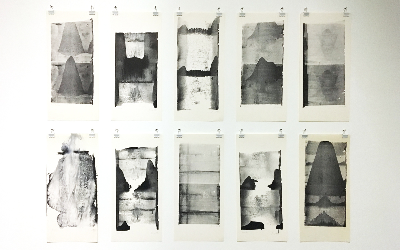
In 1962, Mayer moved even further into this terrain with another series of works called »Yunnan« where formations of ink on paper prevail, without use of any letterforms or any textual composition. These seem entirely empty of semantic content or intent. The titles given to them by the then nineteen year old Mayer were often enigmatic. They appear closely related to the natural formations of landscape that can be found in classical Chinese painting, there often closely aligned to poetry.
Mayer recalled that his mentor Bense found his “print process works” “zu chaotisch” [too chaotic], an adjective that perhaps reveals the difference between them. Though both were radically attuned to language, they were from different generations. It was a contrast that one might suggest played a productive role in ‘super-charging’ some particular elements of the younger man’s work. Mayer brilliantly absorbed many aspects of Bense’s informational and generative aesthetic theories and by means of intensive experimentation turned and transformed these, through, and into “practice”.
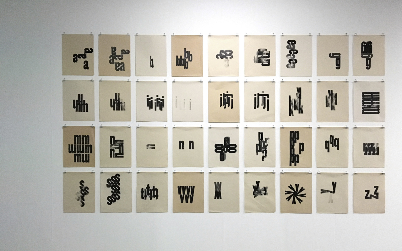
Whilst Bense theorized brilliantly about breaking language into its elements,[4] it is fascinating that in his own concrete poetry he worked with words as his primary material. Meanwhile, Mayer – with his exceptional capacity to utilise the means of production - was taking words apart and breaking them down, into letters, then in to parts of letters and further reducing them to fragments, lines and points, then through techniques such as overtyping, removing them out of reach of everyday meaning. In this sense, he was (unlike Bense, and Eugen Gomringer, another forefather of the Visual Poetry movement) a neo-concretist, committed to the formation and construction of linguistic composites and, at the same time, interested in taking things apart, in processes of deconstruction and disassemblage.A recurrent theme within Mayer’s work from an early stage was intensive experimentation with the alphabet, and in both magnifying and breaking down its constituent elements: the total of 26 letters. In 1962 he made an important series of 26 prints simply known as »alphabet« that formed the basis for many later interpolations. Within these, Mayer amplified and made more intensive the individual letters and the elements from which they were composed, bringing approaches to structure derived from a lineage of concrete art together with information aesthetics that he had absorbed in lectures by Bense. This involved condensing language (or elements of language) into tight and reduced form while forming, through additive and cumulative processes, signs or super-signs. Mayer also used elements of repetition, interfacing core components of writing systems with the serial and numerical and then enhancing all of this by ‘new typographic’ methods to heighten and enhance perception of graphic space and line. It constructively grafted the mathematical with the alphabetical, deploying experimental print techniques to transmute the core elements of Western reading and writing systems.
Mayer continued a process of experimentation with the alphabet throughout the decade of the sixties. Reinhard Döhl, a poet, based in the Literature department at the Technische Hochschule Stuttgart, wrote the introduction to Mayer’s »typoaktionen« in 1967 where he describes how in this (one of Mayer’s master works) he drew on the first alphabet series of 1962, by taking the original configurations then transferring these onto a photographic negative and then using a starsettograph to place these on a surface. Döhl explains how Mayer made no attempt to initially control the positioning of the letters and that therefore “the succession of forms presented by the »typoaktionen« are purely accidental”.[5] He presents it as a example of combining order with disorder, with both consciously intended. The work was made by Mayer as a two-sided leporello. Döhl further describes how:
“Leafing through to the right […] one could speak of accidental typographic design, of accidental structures, the aesthetic appeal of which resides not at least in the accidental neighbourhoods in the existing tension between accidental density and void/blank space and in the un-organized white space and the accidental order of letters. If one was then leafing through to the left […] one could speak of a process of increasing density or compression, of process of filling in which consists of printing the described accidental structures over and over again”.
Reinhard Döhl
"leafing through to the right one discovers accidental typographic forms residing in accidental neighbourhoods in the existing tension between accidental thickness and thinness and in the un-organized white spaces and accidental order of letters: the establishment of order from disorder. leafing through to the left, one observes a process of increasing thickness or filling in, which consists of printing the accidental structures over and over again to an ever-increasing degree."
He was also an inter-generational figure, whose close working over the next two decades on artist bookworks with artists and writers such as Richard Hamilton, John Latham, Tom Phillips, Dieter Roth, André Thomkins and Emmett Williams drew in often subtle ways on knowledge gained through deep immersion in concrete poetry earlier. Between the early and late nineteen sixties, the work of his edition played a key role in the evolution of ‘the experimental poem’ into ‘experimental publications by artists’. Certainly for Mayer, one evolved into the other, realised through his series »futura« (1965–1968) and through his close relations with poets who extended their poems durationally into book form, most particularly Emmett Williams.
After his apprenticeship in Stuttgart, Mayer went for a year in 1961–62 to work in Zurich at a specialist printing company called Orell Füssli, with the aim of further expanding his expertise and knowledge. There he made the series of »alphabet« works during his free time, actively encouraged by the company.
He regularly returned during his sojourn to Stuttgart and began making films with Georg Bense and their mutual friend, Rainer Wössner.
Through exhibitions and events during the early 1960s linked to Bense’s Studiengalerie at the Technical University Stuttgart he met several leading figures in the emerging concrete poetry movement, not least Eugen Gomringer (who took the view that Mayer’s work was primarily picto-typographic) as well as members of the Brazil-based Noigandres group, including Haroldo de Campos, who became a friend and invited him to come and stay with him in São Paulo.
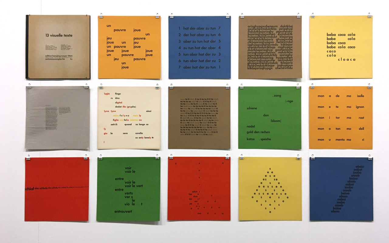
Mayer travelled to South America at the end of 1964, after a journey along the length and breadth of the United States, through Canada, some months in New York and a flight down to Mexico where he spent some time with Mathias Goeritz, a German-born architect, painter and poet who was invited a year or so later by Mayer to do the first in the »future« series of poster poems – this became “die goldene botschaft” or “the golden message” (1965).By the time Mayer arrived in São Paulo in December 1964 he had already published poems by members of the Noigandres group in the »13 visuelle texte« concrete poetry portfolio he had made in early 1964. This was his first publication under the imprint “edition hansjörg mayer”. This collection revealed the international nature of Mayer’s vision as a publisher, a feature that has continued to characterise his edition over three hundred and thirty three titles later.
This first portfolio had an introduction by Reinhard Döhl and included works by the Brazilian poets, Edgard Braga, Augusto de Campos, Haroldo de Campos, Décio Pignatari and Pedro Xisto. Mayer developed a close relationship, professionally and personally, with members of the Noigandres, a group established by the de Campos brothers and Pignatari. Their founding manifesto published in 1958, as »plano-piloto da poesia concreta« [The Pilot Plan for Concrete Poetry], contained many lines resonant with aspects of Mayer’s early work, not least the identification of “graphic space as structuring agent”. They continued:
Noigandres
“With the concrete poem occurs the phenomenon of meta-communication: coincidence and simultaneity of verbal and nonverbal communication; only – it must be noted – it deals with a communication of forms, of a structure-content, not with the usual message communication. Concrete Poetry aims at the least common multiple of language … Hence its affinities with the so-called ‘isolating languages’ (Chinese): ‚The less outward grammar the Chinese language possesses, the more inner grammar inheres in it’ (Humboldt via Cassirer). Chinese offers an example of pure relational syntax, based exclusively on word order…”
Mayer credits Haroldo de Campos with being the first person to grasp or fully understand his work. De Campos coined the term – “typoet” – for him, a term that now seems like a perfect fit. Whilst Bense seemed to find it difficult to accept that what he was making was poetry, »typoems« became the title of Mayer’s first solo exhibition held at the Studiengalerie of the Technical University Stuttgart towards the close of 1965. In two letters to Mayer during that year, de Campos set out his “typoet” tribute to Mayer. In this he described him as “a man who eats reality with types”. [8]
Mayer’s deep understanding of printing was combined with a flair for typography and a poetic intuition that remained open and responsive to whoever he has been working with. His balance of constructivism with openness has involved a keen sense of knowing when to stop, to complete one thing and to move onto another. This has produced a stunning collection of works over almost six decades, many of which have been with artists who have achieved much greater recognition that he has yet received.
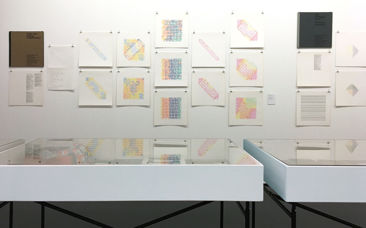
His visionary engagement with early computation, working closely with Frieder Nake on a large print portfolio in 1967, combining letterpress typography, computer plotter drawings and a print out of a computer program has only recently been gaining attention. [9]
Mayer’s early work was widely acknowledged among the network of concrete and visual poetry advocates during the nineteen sixties but the breadth of his contribution has been rarely recognised. One of those to appreciate his contribution was Stephen Bann, who wrote about Mayer in the Introduction to concrete poetry, an international anthology (1967), stating that:
Stephen Bann
“In a sense Mayer’s alphabets constitute a grammar of Concrete Poetry, bringing into clearest prominence the elements with which the poet must work”.
Elsewhere the rare descriptions to be found about him or his processes often contain errors or misunderstandings. One of these is the often-repeated comment that he was a member of the so-called Stuttgart Group. He has always been resistant to being defined by this movement, having begun a series of journeys away from the city in 1963 and moving to London permanently in 1966. Another misconception is that he co-edited with Max Bense and Elisabeth Walther their edition rot, but in fact he just typeset several editions of this.
That said it now seems that an overview of Mayer’s multiple talents and multivalent activities is now becoming possible for the first time, with the publication of a bibliography of his works over six decades. The width and breath of Mayer’s work as a poet, designer, typographer, publisher – and teacher – may now be easier to assess, What becomes clear by looking closely at his lifetime of production is that his is the hand of a master – and that he has a great nose for the scent.
Footnotes
[1] Max Bense, Introduction to »konkrete poesie international«, Edition Hansjörg Mayer, 1965, here quoted from Mary Ellen Solt (Ed.), »Concrete Poetry: A World View«, Indiana University Press, Bloomington. 1970, 74.
[2] See Hansjörg Mayer, Stefan Ripplinger, »Typo«, Walther König, Köln, 2014,15–16, and Hansjörg Mayer, Bronaċ Ferran, »The Smell of Ink and Soil. The Story of [Edition] Hansjörg Mayer«, Walther König, Köln, 2017, 9–10.
[3] Hansjörg Mayer in conversation with Bronaċ Ferran, London, 2016.
[4] See Max Bense “projekte generativer aesthetik” in Max Bense and Elisabeth Walther, (Eds), »rot 19, computer-grafik«; E. Walther, Stuttgart, 1965; and Max Bense, afterword, in »rot 21. konkrete poesie international«, E. Walther, Stuttgart, 1965.
[5] Paraphrased by Reinhard Döhl from his introduction to Hansjörg Mayer’s »typoaktionen«, typosverlag, Frankfurt, 1967, see »Concrete Poetry: A World View«, op. cit., 265.
[6] Reinhard Döhl, introduction to »hansjörg mayer. typoaktionen«, Edition Hansjörg Mayer, Stuttgart, 1967, here quoted from Concrete Poetry: A World View. op. cit., 265.
[7] Augusto de Campos, Décio Pignatari, Haroldo de Campos, »plano-piloto da poesia concreta« (1958), here quoted from »Concrete Poetry: A World View«, op. cit., 72.
[8] Haroldo de Campos, letter to Hansjörg Mayer, October 1965, Hansjörg Mayer Archives.
[9] Bronaċ Ferran, “Re verse engineering: poems on the turn”, in: Irini Papadimitriou, Andrew Prescott, Jon Rogers (Eds.), »Engineering the Future as part of the V&A Digital Design Weekend 2016«, Uniform Communications Limited, Liverpool, 22–29; accessible at: https://lguariento.github.io/Engineering-the-Future/04.html
[10] Stephen Bann, “Introduction”, in: Stephen Bann (Ed.), »concrete poetry. an international anthology«; London Magazine editions, London, 1967, 11.
Bronac Ferran is a writer and curator researching Hansjörg Mayer's "Typoetical Revolution" and other language movements of the 1960s, at Birkbeck, University of London. She is the author of »The Smell of Ink and Soil. The Story of [Edition] Hansjörg Mayer« (Walther König, Cologne, 2017).
She is co-editor of the Spring 2017 issue of the »Interdisciplinary Science Reviews« journal (Taylor & Francis) on interdisciplinary influences in post-war British culture. Her recent exhibitions include »Design & the Concrete Poem« (2016); »a token of concrete affection« (2015) and »Graphic Constellations: Visual Poetry & the Properties of Space« (2014). She edited the books »Art that Makes Itself: Brown & Son«, »Purveyors of Digital Images from 1968« (2015) and »Visualise: Making Art in Context« (2014). She makes occasional radio programmes for Resonance 104.4fm.
