Sey Min
Mobile Traffic Data Visualization
Year
2010–12
Medium / Material / Technic
Animation, color, 30 sec.
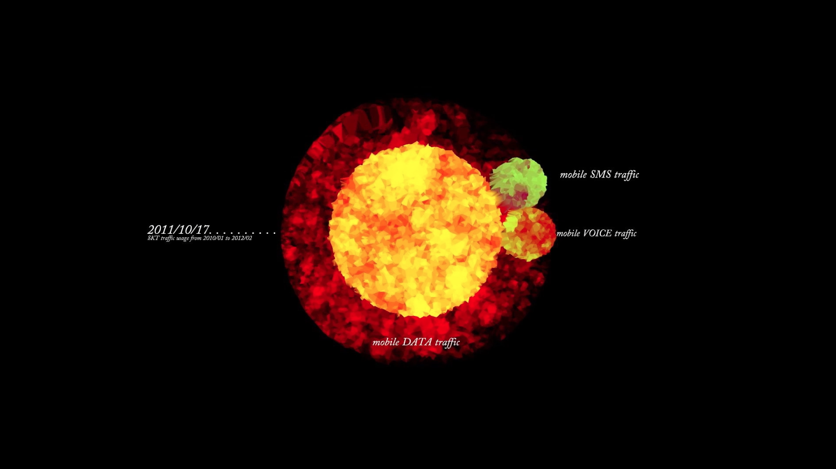
This visualization of raw data provided by SK Telecom illustrates South Korean mobile traffic from 2010 to 2012. Koreans adopted smartphones quickly, with data usage jumping within three months from approximately 10 percent of total traffic usage to 90 percent. This unexpected growth caused traffic delays, and less than 10 percent of total users were responsible for almost 60 percent of the total data traffic consumption. With the increase in data traffic, voice and SMS traffic declined.
Pointing to our changing communication habits and behaviors, it shows how we are increasingly dependent on data to communicate, whether directly or via social media, and that our mode of communication has changed from talking to texting and reading. It also shows that our methods of consuming information have altered.
In line with the idea that technology can enable citizen participation and transparency in political decision-making processes, Sey Min believes that data visualization is a tool that allows us to find our own perspectives by helping us envisage the world around us.
The artist currently runs a data visualization studio in Seoul, Korea.
